Brunch and Wine


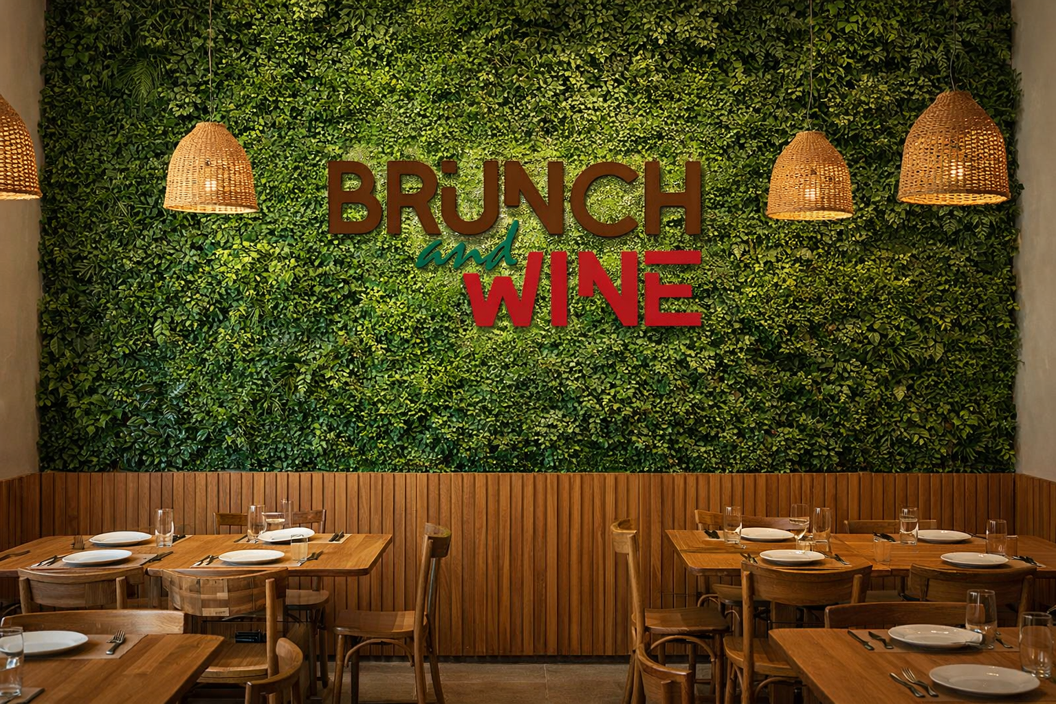
Brunch and Wine | Intimist Restaurant Identity
Context: Brunch and Wine is a boutique restaurant concept designed as an exclusive, high-detail environment with a limited capacity of only 6 to 8 tables. The project required a brand identity that felt both sophisticated and welcoming, balancing the casual nature of a brunch spot with the refined atmosphere of a wine lounge.
Intangible Assets
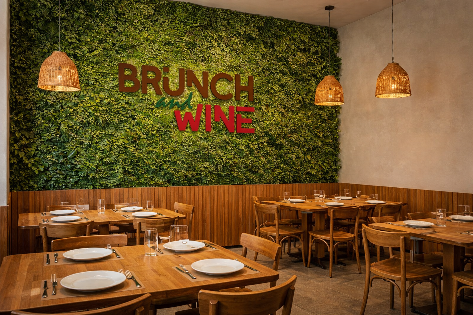
Visual Narrative Strategy: The identity is built on a “Structure vs. Flow” narrative. The tension between the heavy, structural sans-serif typography (representing the substantial meal) and the fluid, organic script of the “and” (representing social relaxation) perfectly encapsulates the dual nature of the brand.
Chromatic Logic: I employed a “Literal-Associative” color theory to trigger immediate sensory responses. Deep Brown anchors the brand in coffee and artisanal bread, Burgundy signals full-bodied wine, and Forest Green provides the necessary organic lift, suggesting freshness and vitality.
Digital Assets
Typographic Fusion: Creation of a minimalist typographic logo that uses a staggered, diagonal composition to guide the eye. The nesting of the script element within the negative space creates a cohesive block that serves as a strong digital anchor.
Technical Versatility: The logo was engineered with high-contrast weights to pass the “Stamp Test.” This ensures perfect legibility across all digital platforms, from high-resolution retina displays to small-scale social media avatars, without losing its structural integrity.
Physical Assets
Architectural Brand Integration: The branding extends into the Vertical Garden Wall of the restaurant. The interior design mirrors the chromatic logic of the logo, using natural woods and lush greenery to create a physical manifestation of the brand’s palette.
Material Adaptability: The bold geometric construction of the logo allows for varied material applications, from laser-cut wood signage to potential stencil applications on industrial surfaces, ensuring the brand maintains its premium feel on any texture.
The Result: The result is a highly cohesive “Brand-Space” where the reputation of the restaurant is physically manifested in the decor. By avoiding temporary design trends and focusing on timeless typographic principles, the identity delivers a premium signal that exceeds its small physical footprint.
Other Work