Icecool


Icecool | Industrial Refrigeration Branding
Context: Icecool is an industrial refrigeration company that sought a fresh, youthful identity. While the firm already possessed a strong international name, it lacked a cohesive visual anchor. The objective was to create a modern logo and innovative physical touchpoints that reflected the “cold” nature of their industrial expertise.
Intangible Assets
Brand Refresh: Developing a “fresh and young” visual strategy to modernize a traditional player in the industrial refrigeration sector.
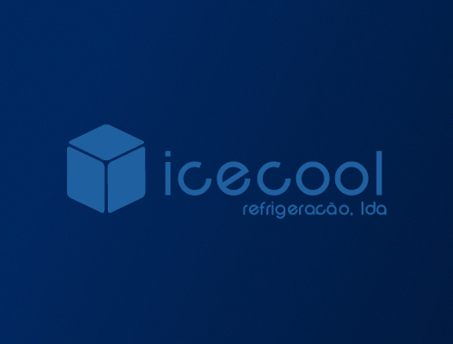
Visual Identity Development: Designing the signature ice cube logo to serve as a literal and professional representation of the company’s temperature-control systems.
Digital Assets
Logo Architecture: Creation of vector logo assets for cross-platform industrial use and corporate documentation.
Physical Assets
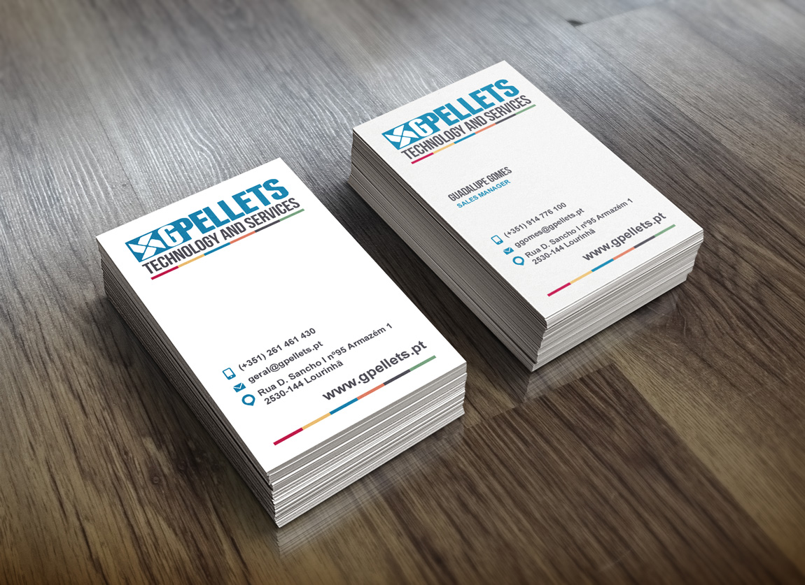
Innovative Stationery: Design and production of translucent plastic business cards, a significant innovation in 2009. The material choice perfectly complemented the ice-themed branding and the geometric cube logo, creating a sensory link to the product.
Low-Cost Branding Infrastructure: The minimalist logo was specifically engineered to be used as a stencil. This allowed the company to brand tools and cardboard boxes using spray paint, ensuring high visibility and asset protection on large construction sites while keeping operational budgets low.
The Result: The introduction of the ice cube logo and the innovative translucent cards provided Icecool with a distinct market presence. By combining high-end stationery with practical, low-cost stencil applications for the field, the brand proved that technical integrity can be effectively signaled through both minimalist design and industrial-grade utility.
Other Work